Today I share with you a little trick to trigger a CSS3 animation on click without javascript, with only pure CSS.
For this snippet, I’ll use a download link that will trigger an animated down arrow on click.
Let’s begin with the link with which we’ll work:
1
<a class="file_pdf" href="#">Download this pdf file</a>1234567
.file_pdf {
	position: relative;
	display: inline-block;
	padding: 24px 0 0 50px;
	min-height: 26px;
	background: url(pdf-icon.png) -17px 0 no-repeat;
}
And our tiny arrow will be like this: (first we only place it in its initial position)
08091011121314151617
.file_pdf:before {
	content: '';
	display: block;
	width: 13px;
	height: 14px;
	position: absolute;
	left: 28px;
	top: -6px;
	background: transparent url(pdf-icon.png) 0 0 no-repeat;
}
Important note: Geoffrey pointed in comments that animations/transitions don’t work yet on pseudo-elements with Webkit. Neither with Opera by the way. So the only browser where these animations/transitions work is Firefox :( (perhaps with IE10?)
Now we can go further with the animation.
In CSS, unlike with javascript, we don’t have events, we only have selectors and pseudo-classes (like :hover or :focus). For the onclick event, we have something quite similar in css, it’s :active. This « state » is active when we click on a link. Great! Let’s try this!
For the beginning we’ll only focus on the movement, we’ll hide it later:
18192021222324
.file_pdf:active:before {
	animation: goDown .4s ease-in-out;
}
@keyframes goDown {
	from { top: -6px; }
	to   { top: 36px; }
}
Oh, wait! Nothing happen when I click!
Hmmm, yep, I think we need to learn more about :active to figure out what’s going on.
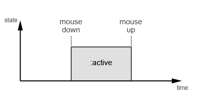 The
The :active « state » begins when we click the mouse button and ends when we release it. So it is the same for our animation: if we release the button before the animation ends, we won’t see it.
With javascript, the click event is triggered when we release the mouse button.
OK, in CSS, what appends at this moment?
The link goes from active to its normal state.
OK, now how can we « select » this « moment » with only CSS?
Precisely, we can’t, but we have a selector which can really help : :not(). With this, we can build a selector that will select the link when it is NOT active, so the animation will be launched when the link goes from its active state to the normal state.
Let’s try this:
18192021222324
.file_pdf:not(:active):before {
	animation: goDown .4s ease-in-out;
}
@keyframes goDown {
	from { top: -6px; }
	to   { top: 36px; }
}
Yata! It works! But… wait! The animation is also launched after page load now!
Yep, it’s the downside of this method, BUT, we can manage it by cheating ;)
But first things first, it’s the good time to hide the arrow at the beginning and the end of the animation.
Since we can’t use display: none; without destroying the animation, we’ll use opacity. We’ll add opacity: 0; to the arrow and deal with it into the animation:
08091011121314151617181920212223242526
.file_pdf:before {
	content: '';
	display: block;
	width: 13px;
	height: 14px;
	position: absolute;
	left: 28px;
	top: -6px;
	opacity: 0;
	background: transparent url(pdf-icon.png) 0 0 no-repeat;
}
.file_pdf:not(:active):before {
	animation: goDown .4s ease-in-out;
}
@keyframes goDown {
	from { opacity: 1; top: -6px; }
	60%  { opacity: 1; }
	to   { opacity: 0; top: 36px; }
}
Good, now we can deal with our page load problem.
The first thing to think is what we will use to hide (again) the arrow. We can’t use the display property or opacity: display will break our animation and opacity will be overwritten by the animation. But we have other possibilities: we could use overflow: hidden; on the link and place the arrow outside the link, but the downside is that we’ll can’t animate the arrow outside the link, we won’t see it. I chose to use the width property: width: 0; will hide the arrow somehow.
I first tried to do that with animation, but everything we add to our « goDown » animation will be done every time, not only on page load. Add another animation? Nop, the new animation will overwrite the « goDown » one.
There’s something else we can use: transitions.
Now here’s the tricky part. Look what happens with a linear transition : (we begin with 0px and we set 13px for the active state)
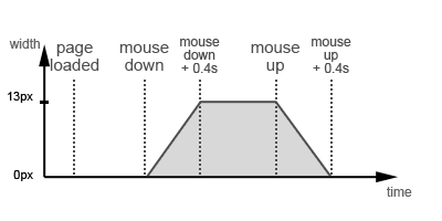
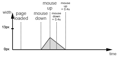
Even worse with a normal click (we don’t hold the button):
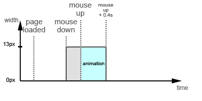
We need something like that:
I think most of you probably know the ease-in, ease-in-out, linear,… values for transition-timing-function, but there are 2 other values: step-start and step-end.
step-start: the element will take the final value of the transition at the beginning of the transition. We won’t see any visible transition.
step-end: the element will take the final value of the transition at the end of the period prescribed by it. We see that a delay has occurred (kind of).
When we release the button, the arrow needs to have a width of 13px: we’ll use step-start for the active state.
Then, the arrow must keep this width during the animation: we’ll use step-end for the normal state… I feel the headache coming…
In short:
08091011121314151617181920
.file_pdf:before {
	...
	width: 0;
	...
}
.file_pdf:not(:active):before {
	animation: goDown .4s ease-in-out;
	transition: width .4s step-end;
}
.file_pdf:active:before {
	width: 13px;
	transition: width .4s step-start;
}
Guess what, we have all we need!
Last detail, we add the browsers prefixes:
0102030405060708091011121314151617181920212223242526272829303132333435363738394041424344454647484950515253545556575859606162636465
.file_pdf {
	position: relative;
	display: inline-block;
	padding: 24px 0 0 50px;
	min-height: 26px;
	background: url(pdf-icon.png) -17px 0 no-repeat;
}

.file_pdf:before {
	content: '';
	display: block;
	width: 0;
	height: 14px;
	position: absolute;
	left: 28px;
	top: -6px;
	opacity: 0;
	background: transparent url(pdf-icon.png) 0 0 no-repeat;
}
.file_pdf:not(:active):before {
	-webkit-animation: goDown .4s ease-in-out;
	   -moz-animation: goDown .4s ease-in-out;
	    -ms-animation: goDown .4s ease-in-out;
	     -o-animation: goDown .4s ease-in-out;
	        animation: goDown .4s ease-in-out;
	-webkit-transition: width .4s step-end;
	   -moz-transition: width .4s step-end;
	    -ms-transition: width .4s step-end;
	     -o-transition: width .4s step-end;
	        transition: width .4s step-end;
}
.file_pdf:active:before {
	width: 13px;
	-webkit-transition: width .4s step-start;
	   -moz-transition: width .4s step-start;
	    -ms-transition: width .4s step-start;
	     -o-transition: width .4s step-start;
	        transition: width .4s step-start;
}

@-webkit-keyframes goDown {
	from { opacity: 1; top: -6px; }
	60%  { opacity: 1; }
	to   { opacity: 0; top: 36px; }
}
@-moz-keyframes goDown {
	from { opacity: 1; top: -6px; }
	60%  { opacity: 1; }
	to   { opacity: 0; top: 36px; }
}
@-ms-keyframes goDown {
	from { opacity: 1; top: -6px; }
	60%  { opacity: 1; }
	to   { opacity: 0; top: 36px; }
}
@-o-keyframes goDown {
	from { opacity: 1; top: -6px; }
	60%  { opacity: 1; }
	to   { opacity: 0; top: 36px; }
}
@keyframes goDown {
	from { opacity: 1; top: -6px; }
	60%  { opacity: 1; }
	to   { opacity: 0; top: 36px; }
}
See ya!
PS1: By the way, happy new year! :)
PS2: I hope you’ll forgive me for my English. ;)


Commentaires
Commentaire de Geoffrey @ Geoffrey.Crofte.fr.
Hi,
Thank you for this article !
Good work !
For the moment, the transition/animation for pseudo-element doesn’t work on webkit.
I had the same problem recently.
A question : why Firefox needs this step on its keyframes ?
1% { opacity: 1; }Regards.
PS : I hope you’ll forgive me for my English. :D
Commentaire de Greg.
Thx Geoffrey :)
Crap, I didn’t notice this problem with webkit. Now I remember that Firefox 4 was the only one to apply the transitions on pseudo-elements at the time. But it was 7 months ago at least, and Webkit still can’t do that >_< Now you know my default browser :)
For the 1% keyframe with Firefox, where do you see that? I only use 0%, 60% and 100% here :/
See ya!
Commentaire de Geoffrey @ Geoffrey.Crofte.fr.
Hi,
Line 48 in the last block of code.
No problem for webkit, just wait and see :p
See ya!
Commentaire de Greg.
Ho, yes, a dumb copy/paste error. Corrected, thx.
Commentaire de Pierre.
Merci beaucoup,
j’apprécie la vitesse à laquelle tu as répondu à mon souhait :D !!
Commentaire de Greg.
@Pierre
C’est vrai que ça y ressemble beaucoup, mais j’ai utilisé jQuery sur le blog ;)
Commentaire de Sam.
C’est une idée de l’excellence…. 8)
Et Joyeux nouvelle année !……mon ami…!!
Commentaire de Fodder.
Hello and thank you so much!
I have adapted this in order to animate a little ship to fly around the page, but only when clicked. My question is that I cannot figure out how to hide the original ship as the animation is active. Once I click it leaves behind a copy of the ship as the animation flys around.
Please look here, in the lower left corner of the page: http://planetexpresscrew.com/home/
Thank you again!
Commentaire de Sébastien.
Salut Greg !
Je viens de trouver ton article en cherchant sur google… puis je vois screenfeed en haut… ha tiens, ça me dis quelque chose :)
Merci pour le tips,
Bonne journée à toi
Commentaire de Grégory Viguier.
Hey salut toi, j’espère que tout va bien :)
Si un jour t’as un peu de temps à perdre, j’ai déménagé, des bières, et plein de trucs à raconter ;)
++
Commentaire de Sébastien.
Mais bien sûr ! :)